The Port Brand - asserting our identity [Off-Season Debate]
We all know the story: Port decided to join the VFL; SANFL forbid it; but Port ended up joining it later anyway. However, the costs were high. The club was forced to be split in two. Moreover, since there was already a black-and-white Magpies in the AFL, Port needed to change its nickname and colors. The parts were reunited, but Port continues carrying two brands: Power (AFL); Magpies (SANFL). Here is my opinion on how Port should deal with this.
---
Identity is such a difficult matter for our club. The 1997 split has really hurt our community, and it still hurts. I believe that a clear identity would help healing it. My suggestion is understanding the Port Adelaide FC as a "family," rather than an "individual."
As I see it, PAFC is ONE club, but with TWO distinct football teams: the Power (AFL), and the Magpies (SANFL). The teams have different colors, monicker, and logo. I am OK with that, but many people aren't. The fact is that the teams lack something that would visually put them together. I came up with a concept of "One Ring to Rule Them All" to solve such an issue.
So, I have no talent whatsoever to draw anything. You all must imagine how my suggestions would look like if drawn by someone competent for such a task.
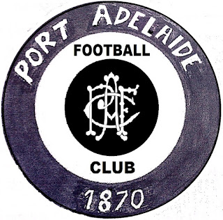
I believe that the common identity for everything related to PAFC should be based on the colours black and white. Even though the club and both teams, each would have its own logo, they would all have something in common: a black roundel with "Port Adelaide 1870" inscript in white letters.
The roundel is simple, and its possibilities are endless. Anything that PAFC could possibly think about doing, it would be able to use the roundel as a kind of signature. It accepts anything in the middle, be it drawing, text, or colour.
As I have said it, the Port Adelaide Football Club would have its own badge, different from its football teams. The logo would be black and white, with the roundel as its outer circle; the inner circle would have an white background with "Football Club" written in black letters; and the core would be black with the old PAFC monogram [which I have made with the letters intertwined] in white:
The Magpies would simply add the roundel to be its outer circle, looking something like this:[1]
The Power's badge would need some extra changes to fit into the roundel, but nothing revolutionary. I have changed the square a bit made it more clear that the fist gets out the prison-bar guernsey. Also, there would be no more teal in the square, but only in the core's background. The bolt would go beyond the core, just like the bird in the Magpies' badge. Finally, in the inner circle, on a black background, it would be written in white letters: "Power Australia." The logo would look something like this:
The roundel would remove any doubt that the Power and the Magpies represent the same organization: the Port Adelaide Football Club, founded in 1870.
Once this is secured, there is nothing the club cannot do with the roundel. It can even add new teams, with new colors and monickers. The black-and-white roundel will work as mark that the team represents PAFC, in the same way as the Power and the Magpies.
For instance, I have a dream of watching the black-white-magenta-blue Port Adelaide ENDEVOUR playing in the AFLW! But this is a subject-matter for another post. I will skip its logo for now.
Another example: if Port wishes having its own clothing brand, why not using the 1912 membership "Ports" logo? The original badge could be used as a secondary logo, while the primary would have the roundel, looking like this:
And so on and so forth.
I think this should be enough for you all top have an idea of what I have in mind. I hope you have all found it interesting.
CARN THE PORT!
---
Notes:
[1] I have changed the current inscription to "South Australia," after feedbacks from BigFooty's Lockhart Road.


Comments
Post a Comment